
Executive Summary
The 2019 Budget is scattered with factual errors. This note covers employment.
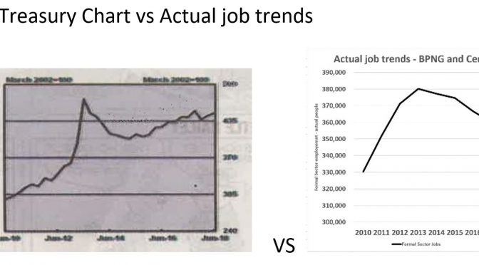
The 2019 Budget claims total employment grew by 1.6 per cent in the last year. In fact, it declined by 2.9%. This significant error was repeated in double page ads promoting the government’s economic performance, with a graph showing employment increasing strongly from 2014. The fact check indicates that total employment has fallen by 6.6% since 2014.
So why do the graphs in national papers and in the budget itself show employment has been increasing since 2014?
Absolute technical incompetence in understanding the difference between an index of numbers and the numbers themselves is probably the most likely answer. However, as there is a pattern of these convenient statistical mistakes, possibly there is a more Orwellian pattern emerging in the details of PNG budgets?
Details
The following information was included in double page ads taken out by the Government on 20 November promoting the 2019 Budget in both national dailies – conveniently on the day the Opposition was providing its budget response. Over coming days, I will provide some analysis of all the points made over the double page spread.
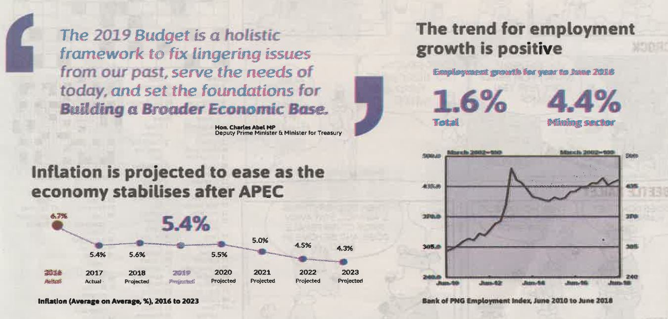
The graph already had confused myself and other researchers familiar with trends in employment in PNG. It first appeared as Chart 16 on page 32 of the 2019 Budget. It was one of those PNG budget anomalies that one let’s go through to the keeper. (For some unusual reason, a phenomena repeated across many countries I understand, not many people actually read the detailed budget documents?!). However, when the graph was highlighted in a double page add by the government to a much wider audience in PNG, it needed closer examination, especially when the heading for the graph was the misleading “The trend for employment growth is positive”. And even more so when it is set directly next to an upbeat message from the Treasurer – how can one “fix lingering issues from our past” if that past is being mis-represented? “Building a broader economic base” risks building on some pretty unsteady foundations if the employment situation is so badly misunderstood.
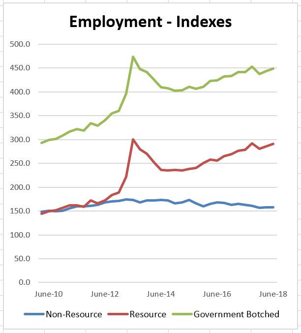
The underlying source for the graph is Table 9.7 of the Quarterly Statistical Bulletin available on the BPNG website. This provides quarterly changes in the index – annual figures are available from page 172 in Table 7 Annex 3 Volume 1 of the 2019 Budget Papers. The graph below shows those indexes from June 2010 (to match the starting point shown in the ads). The bottom blue line is the index for the non-resource sectors, the red line indicates the resource sector. Clearly, looking at the graph, the non-resource sectors of the economy had been declining since 2014 in what looks like a rather flat blue hill. On the other hand, the resource sector had gone through a steep climb and then descent, before a strong recovery, so it looks more like a red mountain.
Then I did something really stupid – just checking – I know that you just don’t add indexes together without checking their respective weights. You’re taught this in basic statistics. However, when doing the crazy thing of adding these indexes together – so giving them equal weights – I ended up with the green line (called “Government Botched”). And the green line is exactly the same as what appears in the 2019 Budget as well as the newspaper ads spruiking the budget. And to confirm this absurdity, it did indeed produce a “total” employment growth rate of 1.6%.
Why is this stupid? One index was based on 351,721 jobs in 2011, the other index was based on 9,011 jobs. By simply adding the two indexes together, you ignore that one index is 40 times more influential in determining total formal employment trends. Is this just technical incompetence? Or a search for a convenient political number pretending there was employment growth in the economy?
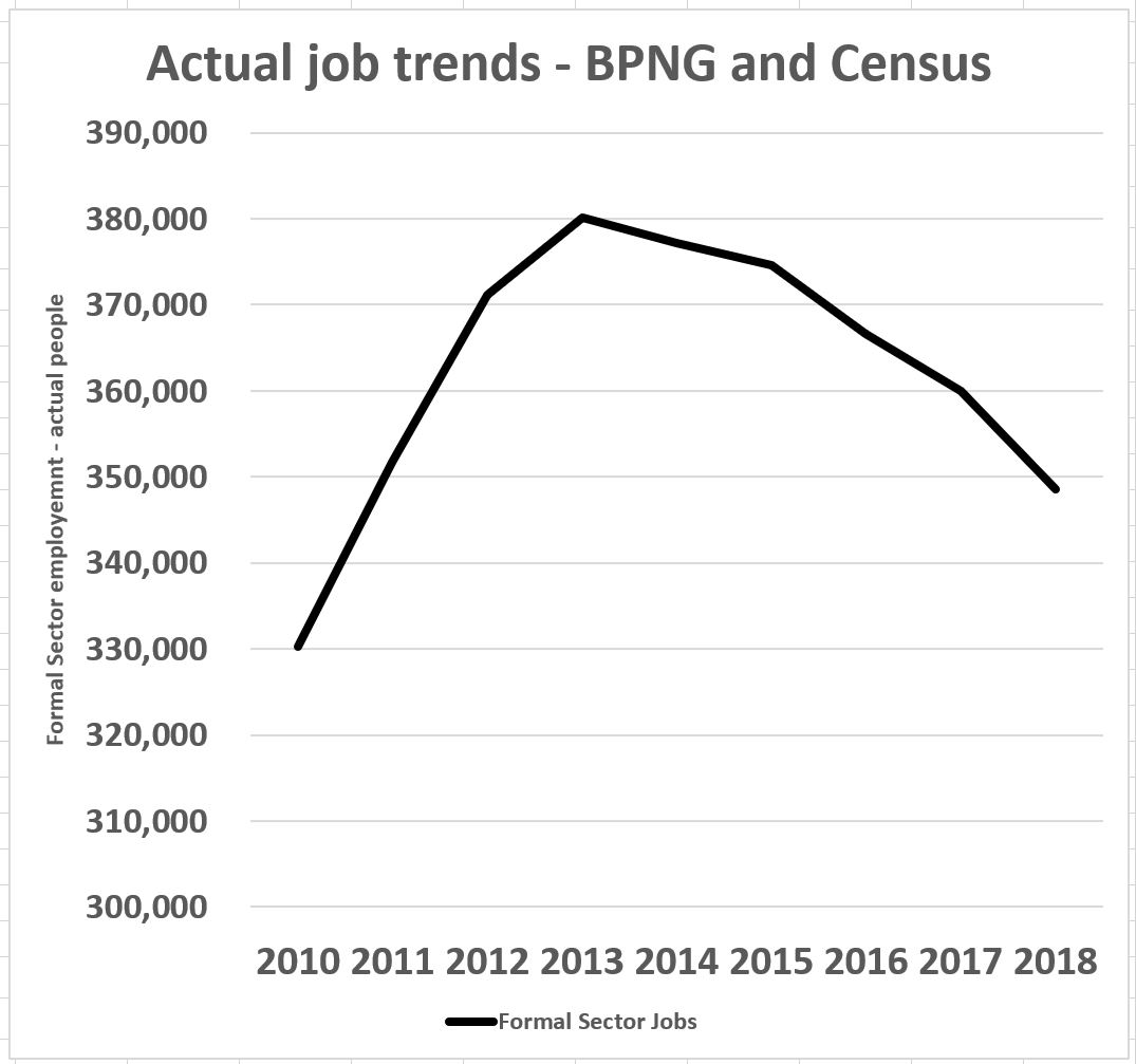
So what is the actual situation? Not surprisingly, given that the blue index line for the non-resource sector represents 40 times as many jobs as the red line, the overall trend closely follows the blue line. The following graph converts the indexes to actual numbers using the 2011 Census estimate of 360,000 formal sector jobs. Actual non-resource estimates are shown by the blue column, and the resource sector is shown by the red bit on the top. The data is extended back to prior years to give a longer perspective.
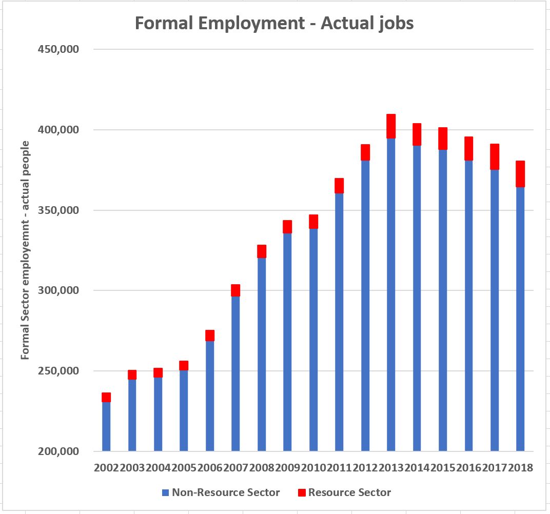
This is such a different story that the newspaper line “The trend for employment growth is positive”. This claim only results from a massive statistical error and misunderstanding of indexes. The actual employment trend since 2014 has been very poor. Since 2014, there has been an encouraging increase in formal resource sector employment of 2,787. However, non-resource employment has dropped by over ten times this amount with a loss of 28,676 jobs, leading to an overall fall of 6.6% in formal employment. The figure should have shown an increase of over 40,000 new jobs just to keep up with population growth.
Indeed, these on-going falls in formal employment is one indicator that the PNG economy is very sick – much sicker than being admitted by the government. And on that issue, I’ll do another blog covering similar technical errors in the 2019 Budget and its GDP figures – including another extraordinary statistical incompetence story of why the PNG government is not using its own National Statistics Office figures.
Even more technical details
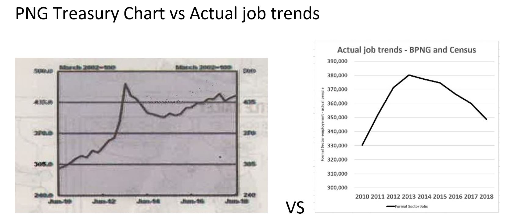
An index converts actual figures back to a common reference point. In the case of BPNG, the reference point is set as 2002 = 100. The index then shows percentage changes from this index point. If one wants to combine different index series, one needs to determine a weight (or the share of the total) to apply to each index before adding them together. This is also usually determined from the base year. So what is called in the ‘non-resource’ sector above is actually the weighted average of seven indexes for different industries – specifically: Retail; Wholesale; Manufacturing; Construction; Transportation; Agriculture, Forestry and Fisheries; and Financial, Business & Other Services. In some unfortunate language, the combined index of these sectors is then titled “Total”, but a footnote indicates that “Total excludes mineral sector”. Table 7 on page 172 in the 2019 Budget Volume 1 describes it as “Total Non-Mineral”. The BPNG Table 9.7 also uses the older term “Mineral” for the column covering all of the resource sector – now including LNG. For the purposes of this explanation (as it will link with a forthcoming discussion of GDP), the combined index is called “Non-resource sector” and the “Mineral” index is called the “Resource sector”. The best recent summary of PNG’s overall employment picture was provided in the PNG Institute for Public Affairs June 2015 publication by L.T. Jones and P. A. McGavin and titled “Grappling afresh with Labour Resource Challenges in Papua New Guinea: Discussion Paper No. 96”. Figures for the structure of the labour force are provided in their Table A8.2.1 which shows the Census estimates of 360,732 formal sector jobs with 9,011 of these being in the “mining and quarrying” sector. Using the “Mining and quarrying” sector, 9,011 formal sector employees in 2011 is linked the BPNG mineral employment index for that year of 163.6. The remaining 351,721 formal sector employees are linked to the “Total non-mineral” index of 159.4. The employment index figures are available from BPNG QEB Table 9.7 and movements in actual numbers can then be mapped to movements in the indexes shown in the “Employment – Indexes” graph above using the simple formula “Current time employment index divided by 2011 employment index times 2011 actual employment figure”. BPNG has had some concerns about the detailed accuracy of the Census results, so has been reluctant to put its indexes into specific job number terms. They were much more confident about mapping employment trends rather than specific numbers of jobs. While understanding these concerns given the difficulties of getting good statistics in PNG, possibly the PNG Treasury would not be making such fundamental errors in assessing employment trends if actual figures were used rather than indexes – at least you can add actual figures together. And putting these figures into a similar simplified graph over the same time frame as the original PNG Treasury chart, the overall result (using year figures where available to help smooth out trends) we get the following graph. This is the same data as presented above, except the resource and non-resource sectors have been combined and the time period only starts in 2010.
This looks very different than the economic graph provided to the papers.
One thought on “1. Technical errors and convenient political claims – Employment”
Comments are closed.