Executive Summary
- PNG’s economic statistics are still corrupted – some figures slip through but others are manipulated to protect the government. Despite an attempt to justify the significant variations from earlier releases, these explanations are riddled with major errors and omissions. The latest National Statistics Office release chooses a GDP estimate slightly towards the government side rather than the IMF/World Bank estimates of the economy. Just enough is done to keep the debt to GDP ratio below the legislative limit of 35%.
- PNG’s living standards have fallen by 10% since 2014 – an extraordinary backward step when 40% of the population was already judged to be living in absolute poverty.
- In contrast, the resource sector has more than doubled even in real per capita terms since 2014. The vast majority of this increase goes to foreign shareholders and foreign debt holders. Most spill over effects from the resource sector are actually measured in the non-resource sector (so teachers’ salaries funded by resource taxes are actually measured in the value add calculations of the education sector, contracts to trucking companies are picked up in the transport sector etc). With the major falls in the non-resource sector of over 10%, clearly the resource sector is not a tide lifting all boats.
- PNG is suffering from the resource curse – the resource sector is booming while living standards for the PNG population are falling. The underlying reasons are as economic theory predicts – poor management of fiscal booms and busts, poor monetary policy undermining competitiveness and creating foreign exchange shortages that cripple growth, a lack of policy consideration to agriculture, SMEs and the informal sector.
- There is a need for an independent assessment of PNG’s economic statistics. Even more importantly, there is a need to change PNG’s development path towards one of inclusive development rather than pro-resource development.
A. The Politics of the NSO release
Statistics are usually boring. Lots and lots of numbers and details. The recent release by PNG’s National Statistics Office of the National Accounts from 2006 to 2016 could easily be seen as a boring document. However, the figures also tell a fascinating political story. They represent some credible pushback on the corruption of PNG’s statistics, but the details reveal the possibility of on-going political interference. The new statistics also have a very worrying bottom line – living standards in PNG have gone backwards by over 10% over the last five years – over K500 for every single person in PNG on average (after allowing for inflation, population growth and taking out the largely foreign owned resource sector). The statistics confirm a general GDP recession in PNG in 2008 (and there was probably another one in 2018) – so PNG cannot claim to have continuous growth over the last sixteen years as senior politicians continue to claim. PNG’s living standards have gone backwards or stayed constant in four of the five last years.
A key political implication of the most recent release is that the Secretary of the PNG Treasury, Dairi Vele, has been lying about why PNG’s national accounts have been suppressed since a very inconvenient preliminary release by the NSO nearly one year earlier. His explanations, in official budget documents and Treasury briefings, have all focused onissues around the price index. As expected (see here) there is absolutely no support for Vele’s explanations in the actual NSO release. The 2017 changes introduced in the new NSO methodology, and which were initially warmly embraced, have been confirmed in the latest report. Indeed, the change in price indexes used to calculate real GDP have overwhelmingly reduced real GDP measures.
Vele’s lies are difficult to interpret other than in the context of his close support for Prime Minister O’Neill (who some say was instrumental in Dairi being flown into the top Treasury job after the ousting of well respected former Secretary Simon Tosali and over the top of strong internal candidates) and the economic narrative of the O’Neill/Abel government. The politicisation of the key economic positions in PNG (including the BPNG Governor) has added to economic mismanagement in PNG.
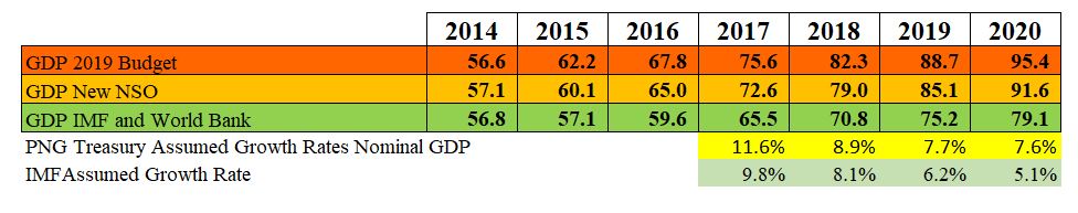
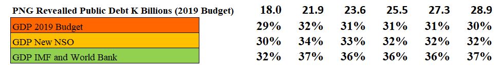
The new set of statistics are an extremely convenient political compromise between the initial NSO estimates for the size of the PNG economy (supported by the IMF and World Bank) and the figures used by the PNG Treasury in the 2018 and 2019 budgets. Specifically, the NSO initially indicated the size of the PNG economy in 2015 was K57.1 billion. The PNG Treasury (so Vele and Abel) said it was K62.2 billion. The compromise figure has come out at K60.1 billion, slightly closer to the government’s figure than the initial NSO estimate. For 2016, the NSO (K65bn) was even further away from the IMF estimate (K59.6bn) and closer to the government estimate (K67.8bn).
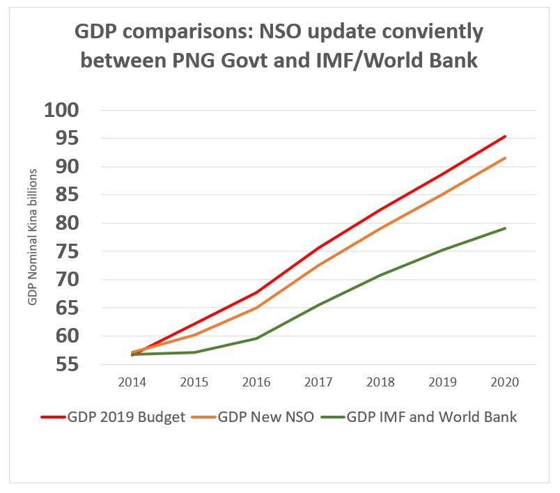
A key political problem with the initial NSO estimate was that it would have formed a base pushing the debt to GDP ratio above the legal limit of 35% (to 37% in 2016 according to the IMF’s 2018 Article IV report). The new NSO numbers conveniently keep debt to GDP below this number at 34% in 2016, only slightly higher than the government’s preferred number of 32%.
B. Are PNG’s statistics still corrupted? – Unfortunately, Yes.
My analysis of PNG’s statistics over recent years led me to the conclusion that they were being increasingly used to tell a convenient story for the government rather than the best measurement actually available (see four articles covering this issue here and here and here and here). With a misleading explanation about why the initial 2015 GDP numbers may have issues, the continuing delay, and indications that the Australian Bureau of Statistics had walked away from providing assistance, the call was made that PNG’s economic statistics were corrupted.
While there is no doubt the front section of the latest NSO release tried to provide a comprehensive 3-page statistical explanation for the difference between the initial 2015 figures and the higher ones now produced by the NSO, and this extra transparency is to be encouraged, my detailed analysis can only conclude that there are still so many errors and inconsistencies that even the latest release cannot be trusted. Going through the errors, some are clearly just careless mistakes. But others suggest an on-going systematic attempt to inflate the GDP figures to meet the political agenda of having higher GDP growth estimates and keeping the debt to GDP ratio below 35%. Yet numbers perversely not on the political radar are allowed to slip through.
The NSO GDP outcomes conveniently ensure that the debt to GDP ratio does not increase above the legislative limit of 35%. On the new NSO figures, this ratio peaked in 2016 and then using Treasury GDP growth estimates thereafter, they are likely to continue falling. This is in contrast to the estimates used by the IMF in its Article IV survey of the PNG economy which showed a pattern of on-going breaches.
The latter part of this analysis goes into considerable depth to justify the argument that PNG’s economic statistics remain corrupted. The key concern is that a comparison of the earlier 2014 figures with the new 2014 figures shows that the NSO fails to justify the nearly K1.5 billion increase in estimated constant price GDP in 2014. There are discrepancies in 18 of the 20 line items covering the constant price estimate (shown in yellow in the detailed tables below) – an extraordinary error rate between the actual changes in the figures and the explanations. Such a detailed comparison cannot be made for the 2015 figures. However, there are patterns within those numbers that also are entirely inconsistent. The explanation for the change in the resource sector actually makes good sense (need to reduce the estimate of intermediate petroleum consumption), but it is implemented in a clumsy and potentially manipulated way. The explanation for movements in the resource sector in 2016 are also internally inconsistent. The details for this analysis are provided at the end of this document – but beware, it includes lots of analysis and detail!
C. The true story slipped through – PNG’s dramatic 10% fall in living standards
However, the new figures and how they’ve been used also reveal the government’s almost exclusive focus on the size of the total PNG economy and its implications for key fiscal ratios. The government’s focus in these areas allows some inconvenient truths to emerge on the true state of the wider PNG economy, especially all parts of the economy outside of the resource sector. I have long argued (as have many others) that movements in the non-resource economy are a much more accurate measure of PNG’s living standards and incomes than a total GDP figure. PNG is a very dualistic economy split between the resource sector and the non-resource sector. There are poor linkages between these two sectors with most resource production shipped overseas with revenues used to pay for loans or dividends to largely foreign shareholders. The linkages that do exist (such as contracts for transport, supplying food, resource taxation paying for government services) are actually measured in the value added of the non-resource GDP sectors. So looking at non-resource GDP actually captures the spill-over links from the resource sector, as well as all other activities such as agriculture and retail sales and construction and government employment etc. For the purpose of this analysis, the technical mouthful “real non-resource GDP per capita” is simplified to what it best measures – movements in PNG’s living standards for its population. Movements in the resource sector, given spill over effects are generally included in non-resource GDP, is almost exclusively a measure of movements in living standards for people outside of PNG.
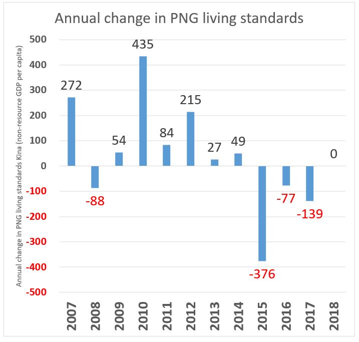
Specifically, the NSO figures show PNG’s non-resource economy was indeed in a deep recession in 2015 with a negative growth rate (after allowing for price changes) of -4.1%. This is a long way from the positive 0.7% figure for 2015 used even in the 2019 Budget. Finally, the NSO has produced a figure that is consistent with all other key economic indicators (employment, imports, tax collections, business sales), external commentators (see UPNG/ANU Update report here) and the broad views of the business and others within PNG. After a significant recession, the usual expectation would be of a strong growth “bounce back” effect so that the economy returns to the underlying growth path. Unfortunately, this did not occur with a poor recovery of only 1.5% in 2016.
So the latest release reveals that the key parts of the economy vital for supporting the actual people of PNG has gone backwards over the combined 2015 and 2016 figures. Indeed, after allowing for population increases, average incomes in PNG fell by nearly 10% over these two years. This is a shocking truth.
Of continuing concern, even using PNG Treasury estimates for 2017 and 2018 included in the 2019 budget, is that this fall in living standards is on-going. The official 2017 non-resource growth forecast is 0.7%, well behind estimated population growth of 3.1%. The 2018 estimate of 3.1% is simply in line with population forecasts.
The key conclusion behind all the statistics from the recent NSO figures is that PNG needs to start on a new path if it really wants inclusive development.
Detailed statistical analysis
This detailed analysis is broken into four sections. It is very detailed given the gravity of the claim that PNG’s economic statistics remain corrupted.
- Examining the base for legitimacy – the 2014 national account comparison
- The big mover – intermediate petroleum consumption
- 2015 and 2016 data inconsistencies
- Detailed table on calculating moves in the structure of PNG’s economy
A. Examining the base for legitimacy – the 2014 national account comparison
The latest NSO report covering 2006 to 2016 (available here as only the statistical tables are on the NSO website) appears to make a very detailed argument for why its April 2019 figures have changed from the figures it provided in March 2018. Indeed, there is a three page “Revision Analysis” providing detailed tables and explanations for changes in both current price GDP (which doesn’t take account of inflation or price movements between years) and constant price GDP (which does take account of price movements).
Unfortunately, the preliminary release on 9 March 2018 only provided the aggregate GDP information – so one can’t actually make a direct comparison at the sectoral level to what was in that release. However, one can make a comparison for all of the sectoral 2014 figures as these were included in the 2017 release covering 2007 to 2014. There is no suggestion from the NSO that it had previously changed its 2014 data – and if it had, it would have needed to provide explanations for the changes between the earlier public sectoral 2014 data, the non-public revised sectoral 2014 data as part of the non-published 2015 update revisions, and the current public 2014 data.
The following table extracts the relevant columns from the old and the new estimates of 2014 GDP. It consists of three parts – the first compares current price GDP, the second compares constant price GDP, and the third compares the price indexes (which are actually the mathematical link between the first two as current price divided by the sectoral price index gives constant price). For each part, the sectors of GDP are shown. The first column covers the original 2014 data, the second column the new 2014 estimates, the third column shows the difference between these two, the fourth column shows the explanation from the latest update, and the fifth column shows any difference between the actual difference in 2014 sector figures and the claimed difference from the latest update. Differences between actuals and explanations are yellow flagged as a possible area of concern.
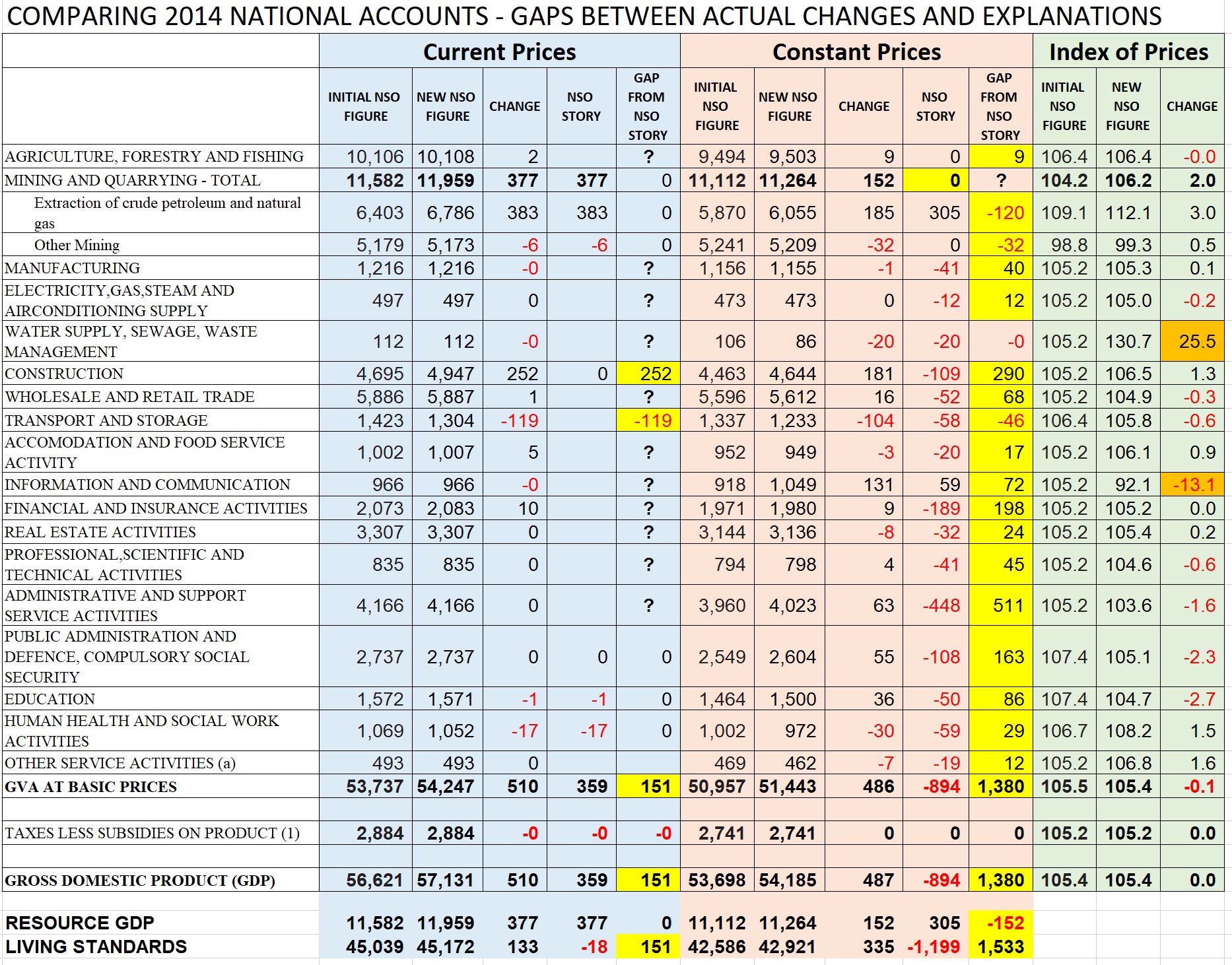
In terms of current prices (the blue section), the NSO only aimed to explain some of the differences – presumably the major ones. The explanations in the resource sector fully account for the differences. However, no explanation is provided for the K252 million increase is the estimated size of the construction sector, or the K119 million fall in the transport and storage sector. Overall, the NSO has increased the estimated size of the non-resource sector by K133 million yet explained a decrease of K18 million. In cricketing language, could let this one go through to the keeper as a lack of care in providing a full explanation for all sectors if other parts of the story were compellingly accurate – but they are not.
In terms of constant prices (the orange section), there are very major issues as shown by the number of yellow flags. There is a gap between the actual change in the sector estimates and the NSO explanation for 18 of the 20 sector lines. The concern is particularly in the non-resource sector where the actual estimate for 2014 has gone up by K335m, yet the NSO provides detailed explanations claiming it went down by K1,199. This is an extraordinary difference of over K1.5 billion. Going through the table and the explanations sector by sector, the story is particularly confusing. For example, the largest discrepancy is the “Administrative and Support Service Activities”. There is no change in the current prices – so presumably the administrative data for this sector was not updated. There was a change in the price deflator from 7% to 5% which led to the K63m increase in the estimated real size of production in that sector in 2014 (so one divides the current price figure by the price index to get to the constant price index). However, the NSO claims there was an actual decrease in real production in that sector by K448 million. Frankly, it is just not possible to reconcile this difference of K511 million in this one sector alone. The NSO reduction of K448m is also the largest adjustment figure for any sector in 2014, yet there is no explanation for the figure. Surely a reduction of over 10% in the real value of the fifth largest sector in the economy should receive an explanation? Yet there is just silence. If one was to look at just the latest NSO report, one could get the impression that the NSO update must be credible because it had actually reduced almost all the sectors of the non-resource economy – indeed a cut of over K1 billion. If the update is decreasing the size of many sectors of the economy, surely it must come across as being more credible! However, this impression is fundamentally misleading as the 2014 non-resource sector in constant prices has actually increased. This K1.5 billion credibility gap provides no confidence that other figures have not been manipulated.
The third section, looking at price indexes, could not include specific sectoral figures explaining the changes in the indexes as these were not provided by the NSO. However, as there is no change in the aggregate price index between the old and new figures (they are both 105.4), the main story is that changes in price indexes are not the reason that the NSO report has been buried for over a year, and that the Treasury Secretary’s explanations linked to the price index story cannot be believed.
B. The big mover – intermediate petroleum consumption
The NSO release spends significant time explaining a change in its methodology which lifts the current price value of the petroleum and gas sector by K383 million in 2014 and a massive K1,900 million in 2015. This change in 2015 explains nearly two-thirds of the entire K3 billion increase in nominal GDP, so it is extremely significant.
Overall, there was indeed a problem with the old figures. But the fix isn’t right either.
The old method assumed about 38% of the total value of all petroleum and gas sales represented value added by other industries, so this needed to be deducted from the total sales figures to calculate the actual value added of the petroleum sector – and production GDP measures value added by industry to avoid double counting. For example, total sales of petroleum in 2013 were K2,447m. The value of supplies and services to the petroleum sector such as transport and security and preparing meals for workers on the LNG project were estimated at 38% of this or K932m. So for 2013, total petroleum and gas sales figures were reduced by 38% to calculate the value added by the petroleum sector of K1,515. This last number, obtained after deducting “intermediate consumption”, gives the value added of the sector which is the figure included in the GDP estimates. If this wasn’t done, there would be lots of double counting when measuring GDP.
The problem is that this 38% estimate continued to be applied even though the PNG LNG taps were turned on and there was a massive increase in export sales. So the old methodology suggested that “intermediate consumption” for this sector jumped from K932m in 2013 to an unbelievable K3,879m in 2014 and then rose again in 2015 to K5,263m. Clearly, these figures were a long way from reality – indeed, the completion of the PNG LNG project possibly would have suggested these figures should have declined – or at least stayed around their previous levels of around K900m with some underlying growth rate. The new methodology phases in a reduction of the percentage of total sales being deducted from 38% in 2013 down to 22% in 2016. However, this still leaves an estimated “intermediate consumption” of K2,724m – nearly triple the historic average. What is going on?
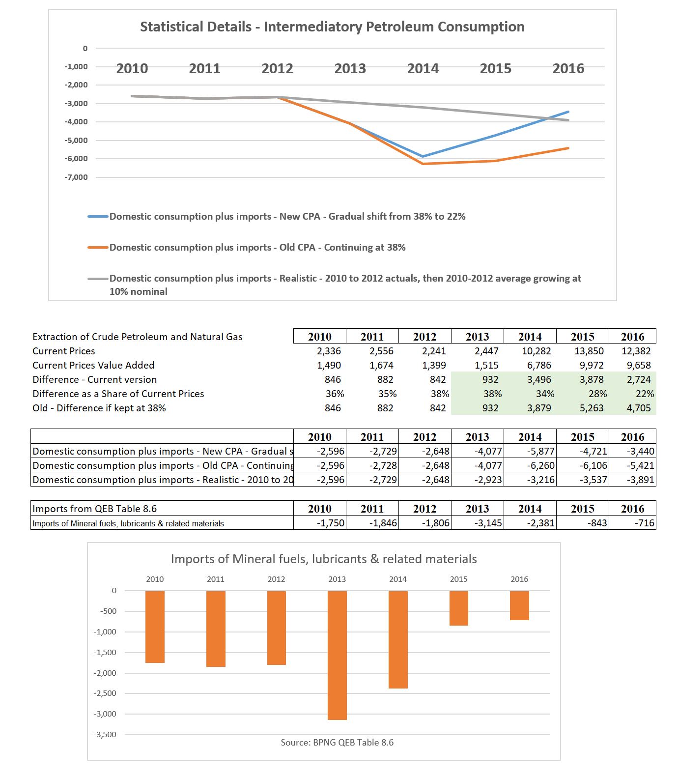
After considerable reflection, my best estimate is that the calculation also needs to deduct the value of petroleum and oil imports. This is not mentioned in the NSO explanations. However, petroleum imports (and related products) have fallen significantly since the PNG LNG project commenced. As shown in the bottom table and graph above, oil imports have dropped from around K1.7 billion from 2010-12 down to K0.7 billion in 2016. This is a massive change and presumably reflects the substitution of previous imports (not part of PNG’s production value add) to part of the “intermediate consumption” of the petroleum sector. Allowing for this drop in imports means that the current 2016 use of the 22% figure is reasonable, although possibly overstating the actual size of 2016 GDP by K441 million (this is shown as the grey line now being below the blue line, implying a slightly larger deduction from total petroleum sales and therefore smaller GDP). One extraordinary item shown by the graph, however, is that the use of the old methodology produced significant underestimates of GDP from 2013 to 2015. Indeed, the implication is that in 2014, GDP in the petroleum sector was probably understated by some K3 billion (the gap between the orange and grey lines). The decision to only slowly phase in the adjustment in percentage terms lifted the orange line to the blue line – but this still implies GDP was under-estimated by K2.6 billion in 2014.
So if a better methodology, based on historical values for intermediate consumption including imports, would produce higher GDP numbers for 2013 to 2015, why wouldn’t the government want these higher numbers? Two possibilities. First, the gain relative to new methodology is gone by 2016 – and presumably this will be the broad case for 2017 (given continuing gas export growth) and even in 2018 (world price increases exceeded the production losses from the earthquake). The government would not want the new methodology producing lower GDP figures for 2016 to 2018. Second, given the reality of growth accounting, higher growth figures for 2013 to 2014 would lead to lower growth figures in 2015 and 2016.
C. 2015 and 2016 data inconsistencies
Section A highlighted major inconsistencies in the updated 2014 figures, their explanations, and the actual changes in GDP in 2014. Although this direct comparison cannot be made for 2015 and 2016 (as earlier figures were not released) there are still inconsistencies that are of significant concern.
Some of the 2015 explanations just leave very major doubts about their accuracy and comprehensiveness. For example, according to the NSO explanations, the largest negative revision is once again in the section titled “Administrative and Support Services”. The change in 2015 from the earlier unpublished estimates is claimed to be an extraordinary drop of K976 million – nearly 25% of the size of the entire “Administrative and Support Services sector”. Outside of the increase in the petroleum sector, this change is more than four times larger than the next closest sector (minus K201 million for the “Financial and Insurance Activities”). Extraordinarily, no explanation is provided for either of these large changes although there is discussion of the smaller government public administration sectors. So how does one get a drop of 25% in the production value of a sector in one year? The underlying current price data indicates an increase in the size of the sector from K4,166m to K4,317m – a 4% increase. It is unlikely that the earlier data would have shown a much larger increase given the economy was not doing well with the end of the PNG LNG construction phase and the severe drought hurting the economy. On price data, the figures indicate that wages and other costs in the sector increased by 8.4% in 2015 – this figure seems high as I’m not sure that many in that sector recall getting an average 8.4% pay increase in 2015. The net impact of a 4% current price increase and an 8% price increase is a constant price fall in the sector of 4%. But the revision figures suggest the first set of numbers showed a real gain in the sector of 20% (so some 25% higher). Even if there was no wage increase (so let’s push the price index down to 0% change), it would have required an increase in current prices in the sector of over 15%. This is just pushing the boundaries of belief – the economy was going backwards at the time and there is no reason that the administrative sector would be showing anything other than slow growth. The price indexes for the public sector also seem high in the new numbers – implying wage increases of 5% each year across the public sector from 2013 to 2016, and an even higher 8% per year for those in the health sector.
For 2016, there are no explanations for “revisions” as 2016 data had not been prepared. However, there still remain major issues undermining credibility, especially the contradictory explanation in constant price GDP growth. This section on page 5 of the release states that constant price 2016 GDP increased by K2,419 million with one of three “key contributing industries” being “859 million or 6.7% in Extraction of Crude Petroleum and Natural Gas”. However, the section then goes on with the extraordinary entirely contradictory comment “The main offset to this positive contribution was the Extraction of Crude Petroleum and Natural Gas with a fall of 314 million Kina or -3.1%.” This is a difference of over a billion Kina. The actual tables indicate a contribution of K859 million. Did an earlier version of the table, possibly using a different methodology, indicate the fall of K314 million? As can be seen from Section B, if it was assumed that the percentage of “intermediatory consumption” was higher, then this could easily take a billion Kina off the 2016 estimates. Implies that there may have been some last minute convenient adjustment to lift the 2016 figures – which once again undermines my confidence in the final figures.
D. Detailed table on calculating moves in the structure of PNG’s economy
So despite all of the doubts about the accuracy of the estimates, and the massive changes in the estimates for the resource sector which drive nearly two-thirds of the increase in 2015 GDP, the government seems to have allowed some inconvenient figures to slip through. In many ways, this does not surprise me as the government (and others more generally) seem to place excessive emphasis on ratios such as the debt to GDP ratio (so the key issues for PNG relative to other countries are the high interest costs of debt relative to the budget and the very high levels of loan principal repayment costs – the fiscal anchors in legislation should be updated).
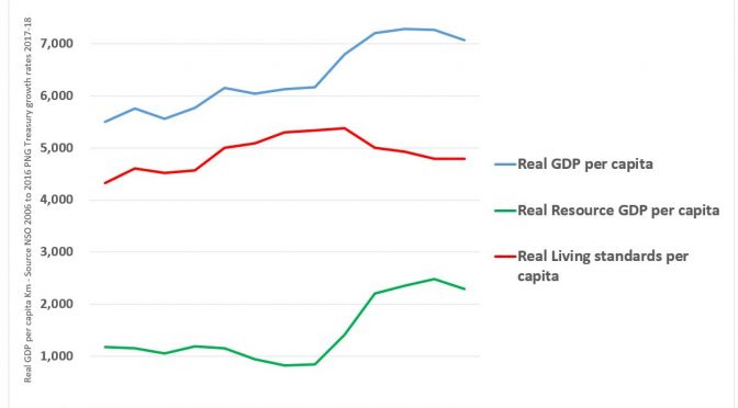
This section analyses the recent release for information on movements in PNG’s living standards relative to the resource sector based on PNG’s new national accounts. One positive aspect of these new accounts is that they now provide data going back to 2006. As the accounts stop at 2016, and on-going trends are of interest, the following analysis uses NSO figures for as the base and then grown according the official growth estimates of the PNG Treasury shown in the 2019 Budget. The following graph is thus based on just two official PNG government sources – the NSO for the economy from 2006 to 2016 and population estimates, and the PNG Treasury for more recent growth estimates. Consequently, the following figures are based entirely on PNG’s own official estimates.
As discussed earlier, PNG is a highly dualistic economy split between the resource sector and the rest of the economy. There are some overlaps such as tax revenue from the resource sector being spent on teachers’ salaries which are then recorded as part of the education sector in the national accounts. Services provided to the resource sector such as transport and supplying food are also captured as part of the ‘value add’ of other parts of the economy. So the usual claimed spill-over effects of the resource sector are actually captured primarily in the non-resource sectors of the economy. The main exception is local employment in the resource sector, but as this accounts for only 0.4% of total employment in the country, it is reasonable to broadly view the resource sector movements as reflecting shifts in incomes of overseas residents, and shifts in the non-resource sector as incomes for local Papua New Guineans. This is the reason why movements in non-resource GDP is the only practical measure for measuring changes in living standards in PNG. Changes in living standards need to take account of the impact of inflation – a Kina now buys much less than what a Kina could buy even 10 years ago. There is also a need to allow for population growth. The best available measure of living standards in PNG is real, non-resource GDP per capita. The following graph therefore uses the simpler language of “living standards”.
The following graph shows how the two parts of the PNG economy have moved in very different directions in recent years (the basis for the graphs are shown in the tables below the graph).
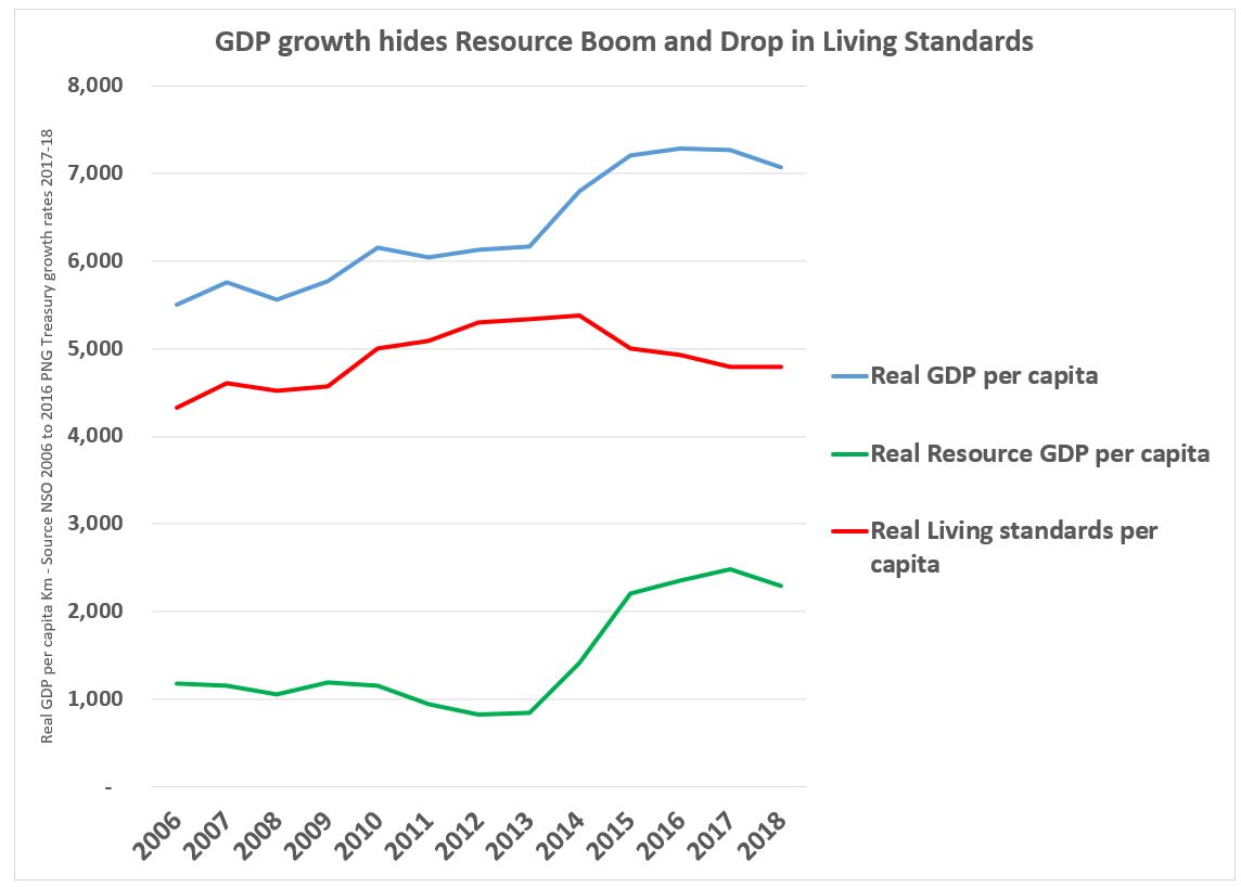
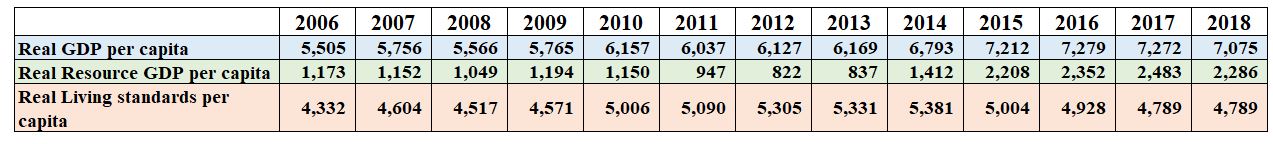
The green line shows real resource per capita. It had been going down slowly from 2006 to 2013, largely reflecting a decline in the output of the Kutubu oil fields and Ok Tedi. The start of the PNG LNG project has had a major effect on this line – more than doubling its level. The resource sector has indeed been booming.
The red line shows the rest of the economy – so the measure for living standards. In contrast, to the resource sector, even after including spill over effects from the resource sector, living standards have been doing poorly in recent years. From a peak in 2014 related to the final elements of the construction phase of the PNG LNG project, there has been a decline of over 10 per cent. This is in contrast to the earlier pattern from 2006 to 2014 when living standards had been slowly increasing.
The blue line shows overall GDP. This line is simply the red and green lines added together. By adding them together, however, and only focusing on GDP, one misses the key issues mentioned above. PNG is a dualistic economy, and in recent years, the resource sector has been booming while living standards have been in decline. This is a classic symptom of the resource curse. Myself and others have discussed the poor fiscal, monetary, exchange and micro-economic settings, combined with corruption and poor service delivery, which both are predicted by and also re-enforce PNG’s resource curse.
The key conclusion behind all the statistics from the recent NSO figures is that PNG needs to start on a new path if it really wants inclusive development.
One thought on “PNG National Statistics Office National Accounts Update – A deep analysis”
Comments are closed.